When deciding on home interior color schemes or choosing colors for rooms, make sure you pay attention to the undertones! Deciding between warm and cool undertones can make or break your interior design!

Hi friends! Today I’m so excited to introduce my cousin Jenn to you! She has a degree in Interior Design and is an expert on the subject! Today she’s going to teach us about the importance of matching your undertones when choosing paint colors for your home! Take it away, Jenn!
Color is everywhere around us, always. Even when we don’t think about it, color informs us when to stop or go while driving; color indicates the mood of a party, and often times will indicate the era in which something was made (does anybody remember those avocado green appliances?)
Even in the lack of color, we find an amazing style of very complicated grays, whites, and blacks that add so much to our spaces.
Color is one of the easiest ways to change the feel of any space and make it your own, even if you keep the other design elements the same. Adding muted tones will give a quiet, soft and romantic feel. Bright colors will give a feeling that is more fresh, vibrant and youthful. Deep jewel tones give a boldness to any space and makes a statement.
How to Use the Color Wheel to Choose Paint Colors
There are a few things you can learn about color to help you make smarter choices, and some rules to follow (or break intentionally) that can make it more fun and give you more confidence as you explore your options.
Designers often use the color wheel, consciously or not, when they work to design a palate. The color wheel is an array of colors blending from one color to the next. You start with the 3 primary colors of red, blue and yellow and go from there.
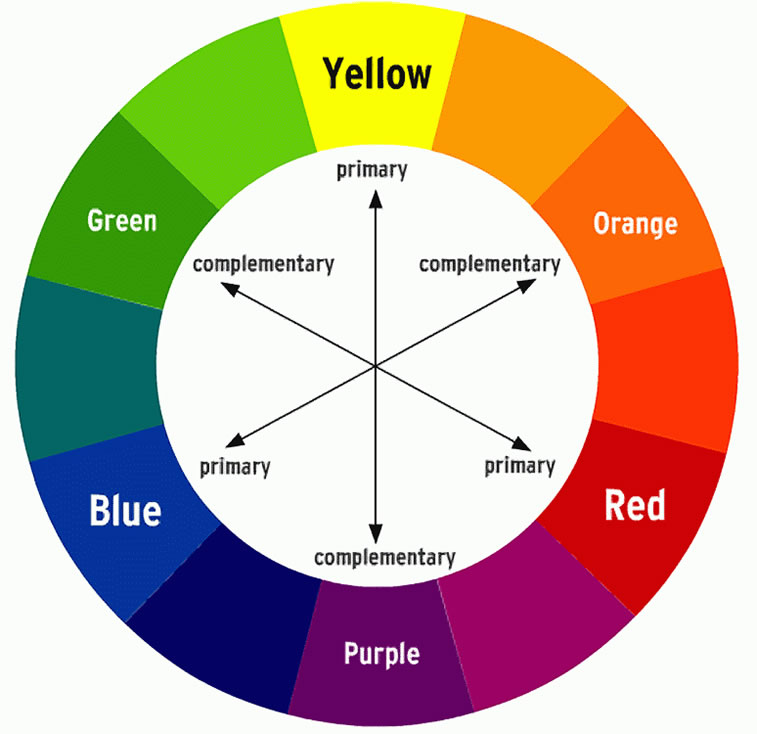
Image source: Wikipedia
The secondary colors would be Orange (a mix of red and yellow), Purple (a mix of Blue and red) and Green (a mix of yellow and blue).
Next you go to tertiary colors, which are combinations of the primary and secondary colors. There are six tertiary colors; red–orange, yellow–orange, yellow–green, blue–green, blue–violet, and red–violet. When these colors are laid out on the color wheel you can follow the basic formula of compliments – any two colors that are directly opposite each other on the wheel. Or any 3 colors that come from splitting the wheel in 3rds.
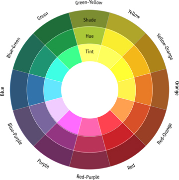
Image source: Robert E. Lee High School
You can use two colors that are next to each other, but you will find that using complimentary colors to some degree in your designs will give you a more interesting and balanced space. Once you have a basic idea of the main colors you want to use, bringing in accent colors are easy to decide based on dividing the color wheel, or at this point, seeing what brings some excitement to your main colors.
Choosing the Correct Undertones for Your Paint Colors
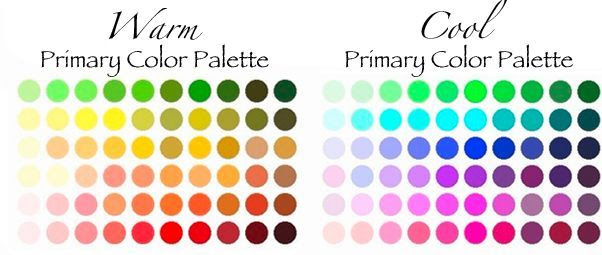
Image source: It’s Perfectly Me
Once you pick the colors you want, deciding on the tone will be important for continuity.
If you find a red you love that has a cooler undertone, you want to make sure the other colors you pick (trim, accent paint, flooring, decor) also have that cooler undertone.
Of course, you can break this rule (with discretion), but more often than not, keeping warmer tones together and cooler tones together will give you a space that feels more cohesive and comfortable to you.
When doing this, make sure you include all the colors from the wall colors, in addition to the flooring and trim colors.
Trim is often painted white, but there are so many different whites on both the warm and cooler tones that you need to be aware of how it all comes together.
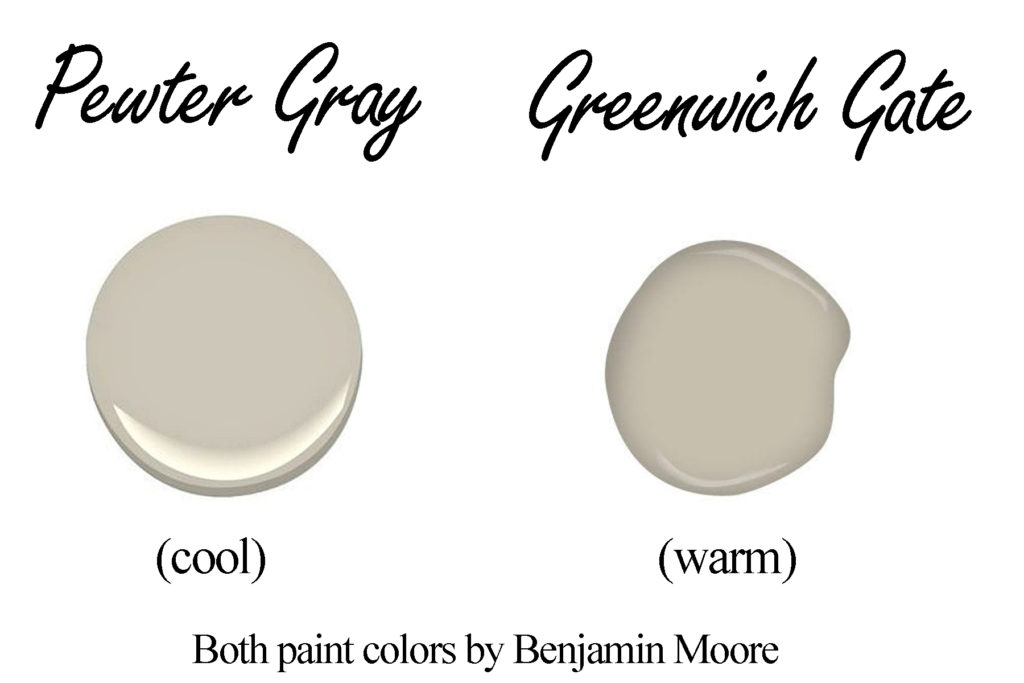
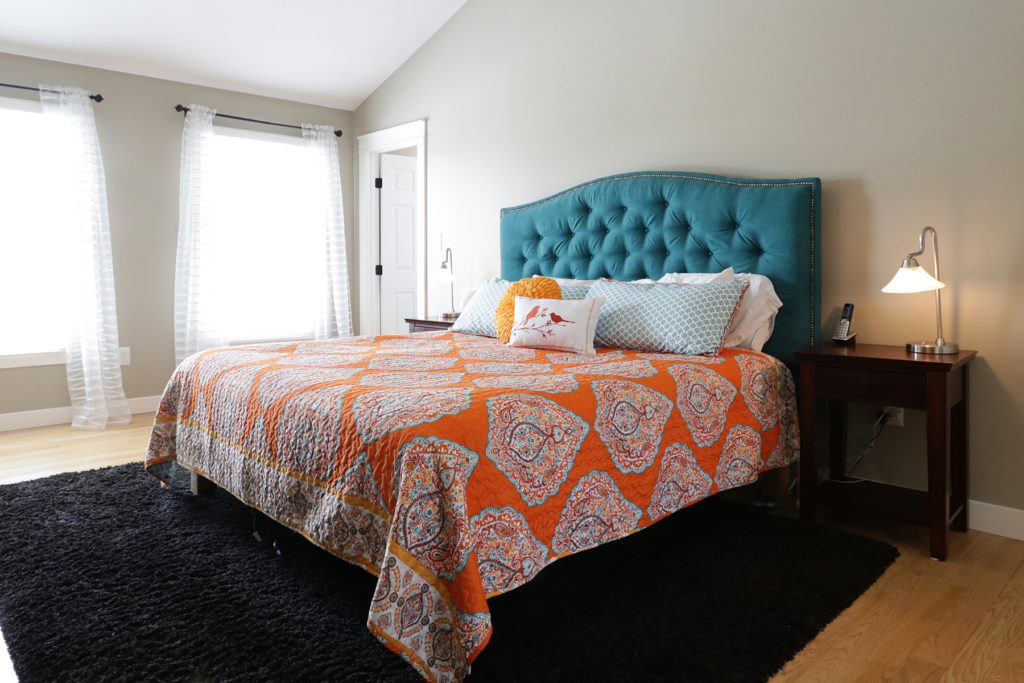
For example, on a recent project we were looking at which paint color to use in a Master bedroom. The flooring was natural red oak which has a warm tone to it. The client wanted something calm, yet not boring. (Not “taupe,” according to the husband!)
A color the wife had seen a lot over the internet was Pewter Gray. But when you look at it, the coloring is much cooler in tone, and against the flooring just didn’t work well.
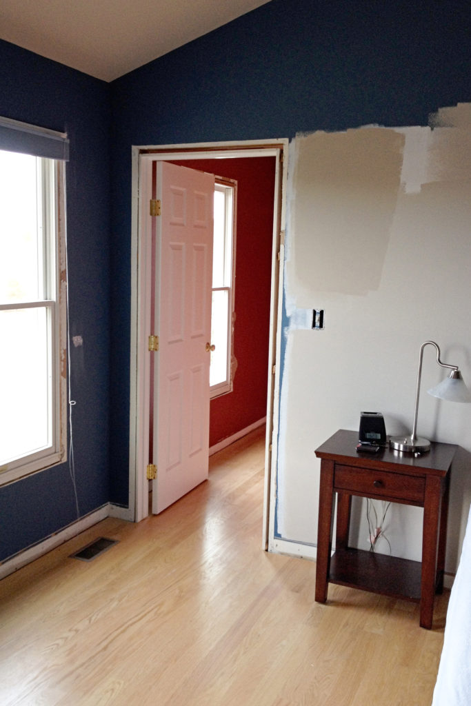
Pewter Gray on most of the wall, with a swatch of Greenwich Gate on the upper portion.
The color we ended up using was Greenwich Gate by Benjamin Moore, which next to Pewter Gray is so similar in all aspects, but it is a definitely warmer undertone. It complimented the flooring so much better, but gave the same comfortable feel to the room.
The trim color chosen was Simply White by Benjamin Moore, because it also has a slightly warmer undertone without being obvious. The end result was a room that was soft, comfortable and interesting.
If you can’t tell if the undertone of a paint color is warm or cool, ask the salesperson. Ideally, they will be knowledgeable and be able to help you.
If all else fails, purchase a small sample can and paint a small area near your floor or trim (or anything else you need to match your paint to) and see how it looks before you invest in gallons of paint.
When looking at refinishing spaces in your home, don’t be discouraged that your space doesn’t fit “home show” quality. The goal of any space is to be comfortable and livable. When you can reflect your personality into your space, whether it’s what’s currently all over Pinterest or not, you will find that you enjoy your time there.
If you’re looking to update or if you’re starting with a new space, consider the colors, be true to your personality, look to match the undertones and be brave! You’ll love the end result.
How to Choose Paint Colors for Your Home Interior
To recap, follow these steps when choosing paint colors for your home interior:
- Choose a basic color for your walls.
- Look around the room and consider the colors of the flooring, trim, curtains, and other decor.
- Based on the other colors in the room, determine whether your paint needs to have a warm or cool undertone.
- Go to the paint store. It may be a good idea to bring a swatch of fabric from your decor or other item you want to coordinate with your paint. Understand that the colors you see online and in the store may look very different when they are on your wall!
- The best way to test if a color will work with the rest of your decor is to get a small sample can of paint and apply a swatch to your wall. Give it a few days and observe it in different types of light.
- Once you are confident that your undertones match, go ahead and paint!
If you’re changing your color scheme and need new decor, be sure to check out my post for Five Great Cheap Home Decor Stores!
 Hi – I’m Jenn Howell. Wife to my best friend and mom of three growing teens & tweens! I have a degree in Interior Design and have many years of experience in various aspects of the industry. In my free time I enjoy learning and exploring more with health, nutrition and education. What I love most is helping others find ways to create joy in their surroundings and discover peace in simplicity!
Thank you for sharing deep insights. Your tips and links are really helpful in good way.