Have you ever wondered about the psychological effects of color in your home? Are there colors that affect your mood? Can certain colors make you happy and energetic, and others make you calm and relaxed? Read on for the answers to these questions, and then take a look at your own home!

(This is a guest post from my wonderful cousin Jennifer who has a degree in interior design. If you missed her first post all about How to Choose Paint Colors for your Home Interior, be sure to read it here.)
When I was in junior high school, I remember going into math class the first week of school and seeing that one wall was painted sky blue, but the other three walls were the normal dirty white all schools seem to be painted! The teacher told us “they” (whomever they were), were running an experiment to see if the room color would affect the behavior of the students.
Apparently, there was another room with one wall painted orange.
(The blue wall was supposed to bring a sense of calm in the students, helping them learn better. The orange was thought to help the students’ brains work faster – but most likely it just caused behavior issues, as it can be a very overstimulating color, especially when paired with bad fluorescent lighting!)
I don’t remember anything else about the blue or orange walls being discussed, or if “they” ever came to any conclusions, but years later I still reflect on that.
There have been many studies over the years determining that colors DO affect people on a psychological level.
In school I was taught things like; If you want to create an eating environment where people will stay, design it in warm reds, yellows and oranges.
If you want to create a place where customers will move in and out more quickly, work with cooler toned blues and whites (or other cool-toned colors). The cool tones create a less cozy feeling, and customers won’t have an interest in staying around too long.
(When you think about it, how many restaurants do you know that are painted in cool tones? The next time you go out to eat, take note, and you’re sure to realize that you are surrounded in warm tones!)
Knowing what colors can do to you subconsciously is like having an extra guide book when working on your own homes.
If you are looking to redesign your space, you can think of the feeling/mood you want in your home, the personality of your family, children and/or yourself, and pick colors and color schemes that will help create that feeling.
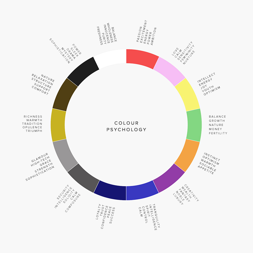
Here is a quick list of colors and the mood they convey for easy reference:
Red
- Red is often associated with A-Type personalities – Bold and strong. Yet reds are also very classic and traditional with feelings of passion, excitement and ambition. Too much, though, can be very overwhelming and tiring. Used as an accent, you can bring a richness to any space.
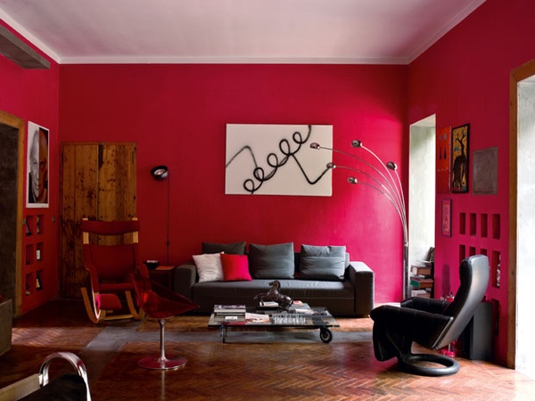
Image from Decoholic.org.
Pinks
- No longer just used for little girls rooms, pink is a delicate color (just a lighter version of red) which can bring in a more feminine feeling. Pink also brings feelings of freshness, nurture, and playfulness.
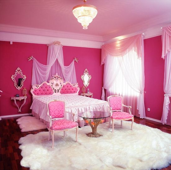
Image from Mygirlyroom.com.
Oranges
- A mix of red and yellow pigments, oranges are also a mix in feeling – bold and strong, but also energetic and youthful. This is a very fun color to use when you want a strong but also happy feeling. Thinking of my Junior High school experiment though, I would stay away from using this in bedrooms as a main color as it can be somewhat overwhelming and overstimulating. Oranges work well with greens, teals and blues.
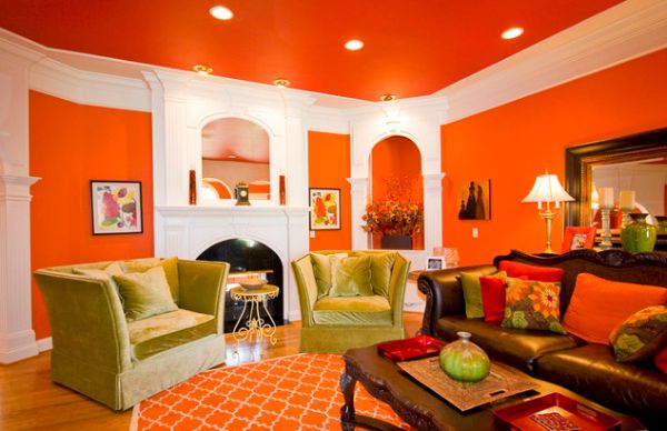
Image from Homedit.com.
Yellow
- Bright like the sun, yellows are happy, optimistic and vibrant with energy. In paler tones, yellow can come across as gentle, soft and nurturing. Great in nurseries, but also great for making spaces feel more warm and inviting.
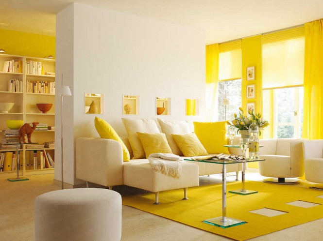
Image from Home-designing.com.
Blue
- Deep Blues such as navy and royal blue bring feelings of confidence, loyalty, trust and success. They can also bring a very classical look to any space. Darker blues can often be used in place of blacks/brown to bring in contrast. Lighter blues are more delicate and have a sense of calm and tranquility (great for bedrooms and bathrooms). The spa blue colors, teals and turquoises add a sense of rejuvenation and calm.

Image from Freshome.com.
Greens
- Green is the obvious signal that spring is here. Greens bring a feeling of growth, rebirth and progress. Green is also the color of money, and can bring a sense of prosperity. Greens are being used more and more to create youthful and vibrant spaces. When matched with its direct compliment red, you have Christmas! But if you match it with browns, you have more stable and traditional feelings. When matched with blues or yellows, you have more playful looks.

Image from Incredabull.com.
Purples
- Purple represents luxury and opulence. In bold hues, purples can be royal, dramatic and somewhat masculine. In lighter hues/shades it is more feminine, giving a feeling of fantasy and tranquility. Purples can match well with reds for very dramatic looks, or with oranges and yellows for more vibrant spaces.

Image from Incredabull.com.
Browns
- Any earth tones give a feeling a stability, comfort and relaxation. They evoke a sense of being grounded. Browns can come across as being more traditional as well. Browns are also very close to gold and can be used as a wonderful accent with blues/grey blues and greens.

Image from Homedit.com.
Blacks
- Black is never just black, so pay attention to the undertones. Black can be associated with death or evil. But when used appropriately, black is what balances the other colors, helping them stand out. I love to use black as a contrasting element, but be careful not to use too much in this way, otherwise it can look like someone who just used too much eyeliner and things can look depressing. Blacks also have a very classic look, which is most often achieved when you add in whites, silvers, or reds.
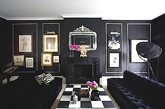
Image from cjdellatore.com.
Greys
- Greys are becoming more and more popular as a neutral. Greys are often thought of as more modern, but depending on the undertones you can create very different feelings. If your greys have warm undertones, they can bring a sense of calm, thoughtfulness and comfort. When you bring in darker, more bold greys, you have a much more confident and strong feeling.

From Incredabull.com.
Whites
- White is another color that spans the whole color spectrum depending on the undertones. With a yellow undertone, the whites are creamy, soft and relaxing, which works well with any neutral or any warm toned color to soften the space. When the whites have blue undertones, they are more striking and work well when looking for a “crisp” feeling. Whites can make your spaces look bigger, but if you aren’t balancing it with other colors and if the white is cooler toned, your space can have a feeling of being sterile, which could be somewhat uncomfortable for a home environment.
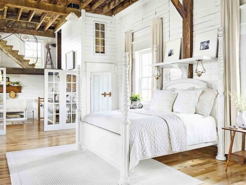
Image from Countryliving.com.
There is a wonderful book, The Secret Lives of Color by Kassia St Clair, that gives so much more information about where colors came from and why they evoke the feelings they do. It’s a fun read which I recommend if you find this as interesting as I do!
Color really is everywhere! When you want to create a space to fit your personality, your lifestyle, or the image of “you,” look for colors and combinations of colors that you are drawn to.
Colors will go in and out of popularity. Don’t get stuck feeling like you have to follow that cycle.
Sometimes bright colors will always be what makes your home comfortable to you. Other times, a mix of neutrals will bring that peace you want. Decide which colors best represent “you,” and enjoy the journey!!
 Hi – I’m Jenn Howell. Wife to my best friend and mom of three growing teens & tweens! I have a degree in Interior Design and have many years of experience in various aspects of the industry. In my free time I enjoy learning and exploring more with health, nutrition and education. What I love most is helping others find ways to create joy in their surroundings and discover peace in simplicity!
My parents recently renovated their home, and my mom ins not sure what color to paint her master room. It’s great you elaborated on how earth colors provide comfort and relaxation. She will love the idea of an earth color to match her furniture as well.
It caught my attention when you stated that blue painting gives confidence, calm and tranquility feeling. My wife and I have been planning on renovating our bathrooms, and we are looking for some color ideas. She will be thrilled to know this so we can start looking for a painting contractor in our area.
So glad it was helpful for you!